You open a carousel called “Five ways to improve your marketing.” The first slide promises better results. The next says to know your audience. Then comes “be consistent,” followed by “add value.” You reach the end without knowing what to do differently.
The problem is not the number of slides. It is that the post has used a lot of space to say very little. A carousel can be beautifully designed and still leave the reader exactly where they started.
A useful Instagram carousel helps someone make a choice, avoid a mistake or finish a small task. Each swipe should give them something they can use. For a small business, the best starting point is often a question a customer has already asked, not a blank design template.
Here is a way to turn that question into a complete post. We will use a fictional florist called Field Note Flowers, then show how the same approach changes for a salon. These are teaching examples, not customer case studies. There is no promised save rate, reach boost or sales result.
Start with the thing someone needs to do
“Flowers” is a subject. “Ordering flowers for a dinner table without blocking the conversation” is a task. The second gives you a person, a situation and a choice you can help with. It also tells you what to leave out.
A florist could write about favourite colours, seasonal stems, vase styles and the history of flower arranging. All might be interesting. But a person trying to organise Friday dinner first needs to explain their table and get an arrangement that fits it.
This distinction has a useful basis outside social media. GOV.UK's content guidance starts with the task a person needs to complete, using evidence about what people are trying to do and where they get stuck. That is guidance for public services, not an Instagram performance study. The principle is still helpful when deciding whether your post has a real job.
Look through questions from the counter, email or messages you are allowed to use. What did someone need explained before they could order? Where did a short answer lead to three more questions? Remove names and private details. You want the shared problem, not a screenshot of a customer's conversation.
Write the task in a plain sentence: “After reading this, someone should be able to send us a clear brief for dinner-table flowers.” If the sentence ends with “understand our brand better,” keep going. What could the person actually choose or do?
Not every task needs a carousel. A changed closing time may need one clear image and a caption. A quick answer may be better as text. Use several slides when the reader benefits from a sequence, a comparison or a worked example. Do not stretch one useful sentence across five images just to fill a format.
Write the last slide before the first
The last slide tells you whether the idea has a useful finish. For Field Note Flowers, it could be a short message someone can copy when asking for a quote. That is a more concrete ending than “Follow for more flower tips.”
We are hosting [number] people on [date]. Here is a photo of the table. We would like [the height or feel you want]. Our total budget is [amount], including [collection or delivery needs]. What would you suggest?
Now work backwards. To write that message, the reader needs to know why the table matters, how to describe the height they want and which practical details affect a quote. Those become the middle slides. The cover can promise exactly that help.
This stops the familiar pattern where a team designs an exciting cover, writes whatever fits in the middle and adds a booking button at the end. The promise, explanation and next step now belong to the same task.
Try making the headings read like a short conversation. “Ordering flowers for a dinner table?” leads to “Show the table with the place settings.” Then “Say whether you want to see across it.” Each answers a question raised by the one before it.
A simple editing test is to swap two middle slides. If nothing changes, you may have a list rather than a sequence. Lists are not wrong. A checklist of things to bring can be useful in any order. But if you claim to explain a process, the order should help the reader follow it.

A complete example, from cover to useful finish
Here is the finished six-slide example for our fictional florist. Browse it as a reader would, then open the copy and photo notes below to see how each slide works. Six is simply enough for this example, not a claim about the best-performing length.
THE DINNER TABLE EDIT
Ordering flowers
for a dinner table?
Three details to send your florist
before asking for a quote.
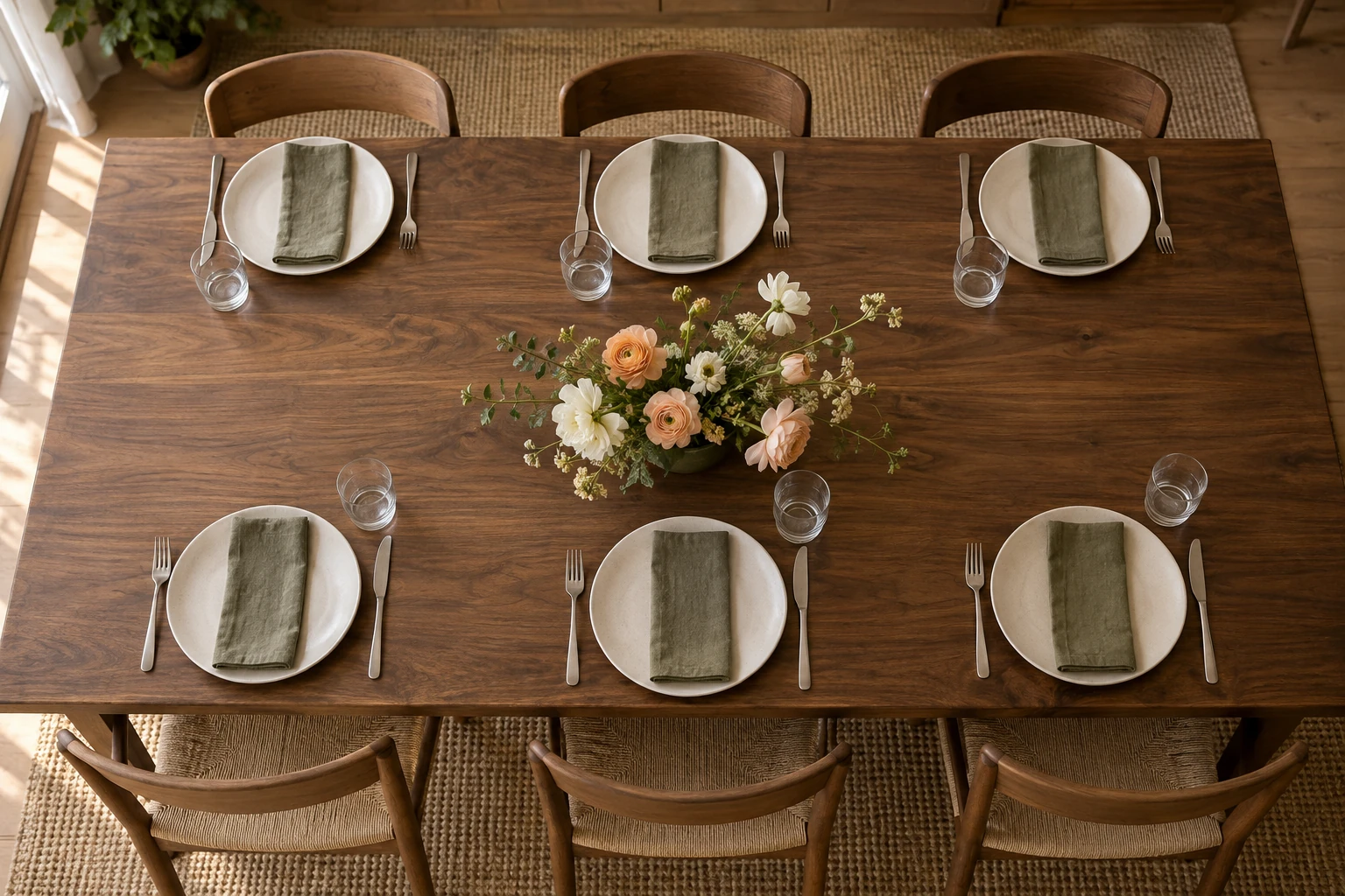
Show the table
with the plates on it.
A table can look roomy until food, glasses and place settings go down. Send a photo and say how many people are coming.
Say whether you want
to see across the table.
If easy conversation is the priority, ask for an option that keeps the view between guests clear.
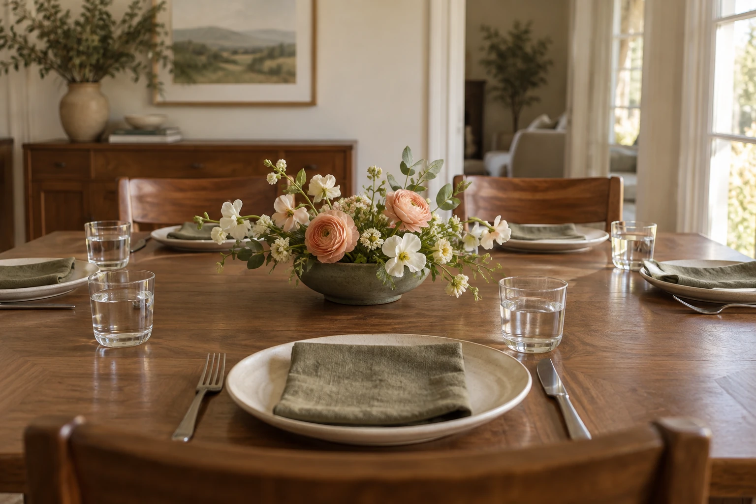
No flower names?
Start with the setting.
A table photo, the height you want and the practical details give the florist something clear to work from.
Likes are not shown in this example.
fieldnoteflowers Planning flowers for a dinner? Start with the table, not the flower names. … more
Copy this brief: We are hosting [number] people on [date]. Here is a photo of the table. We would like [the height or feel you want]. Our total budget is [amount], including [collection or delivery needs]. What would you suggest?
Send the table photo and guest count, explain the height you want, and include the date, total budget and collection or delivery needs. Ask what the quote includes.
Fictional teaching example. AI-created illustrative photos, not customer work. No enquiry is sent from this preview.
Use the arrows or dots, swipe on your phone, or focus the image and use the arrow keys.
The slides use photos where the setting matters and simple text where the reader needs a brief or checklist. They keep one type style and a small set of colours throughout. The full copy and image notes are below if you want to look more closely.
Read the slide-by-slide copy and photo notes
Notice what the post does not do. It does not claim that one flower style suits every table. It does not promise a price, delivery area or available date. Those depend on the real business and order. It gives the customer a better way to start the conversation.
The caption can add the copyable message above, followed by the florist's actual enquiry instructions. Keep the useful part before the sales line. If enquiries go through a form, send people to that form. If the team uses messages, check that someone can answer them. A helpful guide should not lead to an unattended inbox.
For a salon, the same structure might answer “What should I bring to my first haircut consultation?” The middle could help someone choose reference photos, explain how they style their hair at home and describe what they do not want. The finish would be a short consultation note, not the florist's ordering checklist with different colours.
That difference matters. Reuse the way you think, not every sentence. A good template saves layout work while leaving room for the business's real process and the customer's real uncertainty.
Make the second slide earn the next swipe
A strong cover earns a look. The next slide needs to start delivering the answer. “Before we begin, let's talk about why flowers matter” delays the useful part. “Show the table with the plates on it” gives the reader something to do immediately.
GOV.UK's guidance on titles recommends clear, descriptive language that makes sense on its own. Apply that as an editing test, not as a rule imposed by Instagram. “Before you order table flowers” tells a person more than “You need to know this.” Curiosity can help, but the subject should not be a secret.
Every middle slide needs both a point and enough detail to use it. “Think about the space” is a point. “Show the table with the plates on it” turns that point into an action. The extra sentence explains why, while the photo shows what to look for.
When a slide feels thin, do not add another slogan. Add the missing example, choice or reason. When it feels crowded, ask whether you are answering two questions at once. Move one out, or make it a separate post. Shrinking the words until they fit is usually a sign that the editing is not finished.
Read just the headings aloud. Then read the full post. The first pass checks the path. The second checks whether you actually deliver what the headings promise. Cut introductions that repeat the cover, conclusions that repeat themselves and any slide that exists only to delay the answer.
Use the design to show, not just decorate
A picture should help answer the question on its slide. In our example, a seated view across the table explains the height issue better than another beautiful overhead flower photo. Different pictures can belong to the same brand without all doing the same job.
Keep the type and colours steady enough that the post feels like one piece. Change the visual when the explanation needs it: a wide view for context, a close view for detail, a short checklist for the finish. You do not need a new layout on every swipe to make the post interesting.
Review the exported images at the size they will appear on a phone. If you need to zoom to read a sentence, shorten it or make it larger. Leave room around the words. Avoid tiny footnotes that carry important conditions, such as a price limit or a booking requirement.
W3C's web accessibility guidance uses a contrast ratio of at least 4.5:1 for normal text, with a lower threshold for qualifying large text. Treat that as a useful design benchmark here, not a declaration that checking one ratio makes a social post fully accessible. Dark text on a quiet light field is often easier to manage than text over a busy photo.
Words baked into an image also need a text route. W3C explains why actual text is more flexible than an image of text and why text alternatives should carry the image's words when that format is necessary. Put the essential advice in the caption as readable text. Add meaningful alternative text wherever the publishing tool supports it, and check the result. “Slide three” is not an explanation of slide three.
In the example, the table photo needs a description of the clear sightline. A checklist needs its actual items. Avoid turning alternative text into a string of keywords. Its job is to give someone the information they would otherwise miss.
Check whether the post was useful, not just popular
Before publishing, ask one person to use the guide. Could they write the flower brief without asking what it means? Could they find the next step? This is a small practical check, not proof that the wider audience will respond in the same way.
After publishing, look for clues that match the task. Did enquiries include the table photo or date? Did people ask a new question the guide failed to answer? Saves and shares may be worth watching, but they do not tell you whether someone followed the advice or placed an order.
Avoid claiming that a particular slide count unlocks reach. Meta's published explanation describes ranking as a combination of predictions, not one perfect signal. That source is from 2023, and it is not evidence for a current carousel-length trick. This article's structure is about helping a reader, not reverse-engineering distribution.
If the guide leads to better questions, use those questions to improve it. If it gets attention but causes confusion, fix the confusing part before making a longer version. Our guide to checking whether social media brings customers explains how to keep attention, enquiries and actual orders separate.
Unstudio can help turn your business context into a content plan and draft posts, including carousels. Give it the question people ask, your real answer and any photos that help explain it. Review the result for the same things you would check in a post you wrote yourself: a clear promise, a useful sequence and accurate details.
The goal is not to produce more slides. It is to leave someone better able to do something. If you need a starting question, use the five questions a useful business feed should answer. Then bring that context to Unstudio and build a post around one of them.
Field Note Flowers is fictional. The browsable carousel, slide copy and visual plan are teaching examples, not a published account, customer result or performance benchmark. Its photos are AI-created illustrations. Adapt the content and use real business photos before making claims about actual work. Sources were checked on September 12, 2026; the carousel example was added on September 15.